Art Berman Newsletter: October 2020 (2020-9)

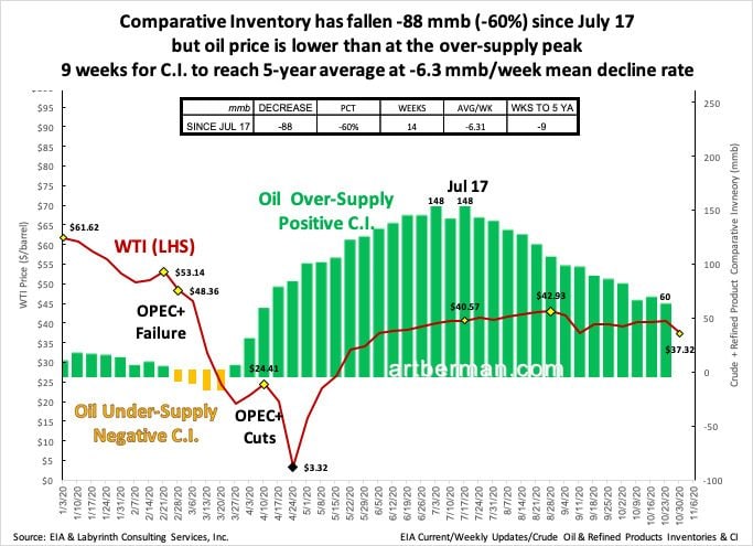
The U.S. oil-supply surplus has been reduced by 60% yet prices are lower than at the surplus peak in mid-July (Figure 1). At the current rate of weekly decline, comparative inventory (C.I.) should be at the five-year average by the end of the year. The last time C.I. crossed below that threshold in late February, WTI was at $48.36 per barrel—more than $10 higher than it is today.

9 weeks for C.I. to reach 5-year average at -6.3 mmb/week mean decline rate.
Source: EIA and Labyrinth Consulting Services, Inc.
Analysts blame weak demand, increasing output from Libya and convenient news-cycle explanations but the truth is that they don’t know. That’s because they don’t really understand the system dynamics that affect price formation. Complex systems like oil markets are characterized by interdependent factors, feedback loops and ambiguous causality.
Comparative inventory is an approach to interpreting how the market prices a commodity. It is based on comparing working supply for a particular period with the same period in previous years. Markets seem to have a kind of collective memory and an expectation for what the components of supply—domestic production, net imports and storage—should be.
Storage or inventory is like supply’s saving account. When inventory/savings is increasing, there’s nothing to worry about. When it’s decreasing to pay expenses that cannot be otherwise met, there may be a problem with liquidity.
The C.I. value is automatically adjusted or normalized for seasonal variation by month or week. The moving 5-year average, therefore, becomes a proxy for market expectation. The market is usually long when C.I. is less than the 5-year average and short when it is more than the 5-year average. The y-axis in Figure 2 represents the dividing line.
The trend line that fits C.I. vs spot price for a particular time period is called the yield curve. When C.I. is in deficit and demand exceeds supply, markets typically increase price— or yield—forcing consumption to decrease. Higher price sends a signal to producers to drill more wells. Conversely, when C.I. is in surplus, lower prices stimulate consumption while causing producers to drill fewer wells.
The mid-cycle price is where a yield curve intersects the 5-year average or y-axis. That represents the market-clearing price of the marginal barrel at the 5-year average needed to maintain supply.

Source: Aperio Energy Research and Labyrinth Consulting Services, Inc.
The most important characteristic of the yield curve for 2020 oil prices is its slope. Yield Curve 1 in Figure 2 has a steeper slope than Yield Curve 2. That means that the market had a greater sense of supply urgency during the period described by Yield Curve 1 than for the period of Yield Curve 2.
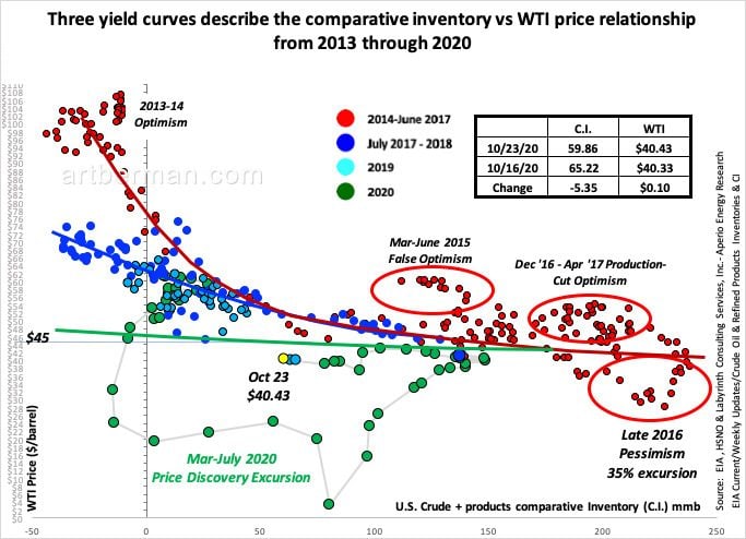
Figure 3 shows real C.I. vs WTI price data from 2013 to the present. Three yield curves describe different periods of price formation. The red curve fit 2013 through mid-2017 data based on market sense of supply urgency. Oil prices collapsed in 2015 and 2016 but the right-hand tail of the the red yield curve continued to describe the price-volume relationship.

Source: EIA and Labyrinth Consulting Services, Inc.
As C.I. moved back toward the 5-year average and prices increased in late 2017 and 2018, prices did not return to the red yield curve except during brief excursions. Markets felt less supply urgency than previously because of the abundant supply from tight oil. The blue yield curve continued to describe price formation through 2019.
When prices collapsed in March 2020, markets went on an extended price-discovery excursion as WTI weekly prices fell to almost $3 in April . Since mid-July, price has stabilized around and somewhat below the green yield curve in Figure 3.
That curve is almost flat reflecting limited supply urgency. That is why price has not increased despite fourteen weeks of falling inventories.
Some people criticize comparative inventory. They say it is a backward-looking indicator because it relies on comparison to the 5-year average. Perhaps they can explain why my price predictions using C.I. have consistently beaten those by people who criticize this method.
Others say it is a flawed method because the yield curve is an imperfect regression. Dynamic systems seldom conform to the mathematical neatness that humans expect from nature. In fact, the excursions from the yield curve are at least as important as the reversions because they represent price discovery. Trial-and-error is, after all, the most effective way that humans learn.
Finally, some say that C.I. is unreliable because yield curves change over time. I wonder if they similarly disparage bond yield curves that do exactly the same thing. As markets re-price and re-value commodities and securities, the yield curve must change.
What the yield curve tells me is that there is little likelihood that oil prices will increase to much above $45 on a sustained basis until the market changes its sense of supply urgency. Until that happens, the yield curve provides good opportunities to play the excursions. For the last six weeks, for example, WTI has been consistently $4 or $5 under-priced. It will revert and that could convert into profits for knowledgeable investors.
Comparative inventory is not a solution but it is an unequaled calibration technique that often makes sense of confusing and seemingly conflicting information.
Like Art's Work?
Share this Post:
Read More Posts